A book’s interior layout isn’t just about placing words on a page. It’s about creating a reading experience that is visually appealing, comfortable to navigate, and structurally sound for printing. Whether you’re self-publishing or working with a traditional press, understanding the book layout basics gives you more control over both aesthetics and functionality. Trim size, margins, and white space may seem like small decisions, but they shape how your readers interact with your book and how much it costs to print.
Let’s break down why these elements matter and how they tie into broader book design strategies.
Understanding Trim Sizes and Their Role in Layout
Trim size refers to the final dimensions of your printed book. It’s what readers hold in their hands and what printers use to calculate costs. From pocket-sized paperbacks to large-format photo books, trim size plays a vital role in defining a book’s genre, audience, and usability. For instance, novels typically use a 5.5” x 8.5” or 6” x 9” trim size, while workbooks or coffee table books might go larger for visibility and usability.
Selecting the right trim size is one of the earliest steps in layout planning because it impacts every other component, from font size to margin width to how many words appear per page. This choice also has direct implications for print costs. Smaller trim sizes lead to more pages for the same word count, increasing the cost per copy. On-demand printers like Amazon KDP and IngramSpark charge based on page count, so your chosen dimensions can alter your budget significantly.
Moreover, each trim size requires adjustments to your interior layout to maintain balance between text, images, and white space. Choosing a size that complements your content ensures a seamless transition between sections and avoids awkward page breaks.
Margins: Where Design Meets Practicality
Margins act as the breathing room for your content. Too narrow, and the text feels claustrophobic; too wide, and you waste valuable space or inflate page count. They’re not just about aesthetics. They affect binding, readability, and your book’s overall flow.
The inside margin, often called the gutter, is particularly crucial for printed books. Without enough space here, words can disappear into the spine. A thoughtful interior designer considers the binding method, perfect-bound, saddle-stitched, hardcover, and adjusts accordingly to ensure that nothing is lost.
Margins are also essential for annotations, page numbers, headers, and footers. When planning your interior book font selection, for example, the margin size will influence how large your typeface appears and whether additional spacing between lines will still fit neatly within the page.
More than just boundaries, margins support the layout’s rhythm and help guide the reader’s eye naturally through the text. They’re part of a greater system of book layout basics that prioritize comfort and structure.
White Space: The Unsung Hero of Readability
White space, also known as negative space, is the open area between and around text blocks, images, and design elements. It’s not “wasted space”; it’s a strategic tool that adds elegance, prevents fatigue, and creates hierarchy in your content.
A cluttered page with dense paragraphs can overwhelm readers, making them less likely to engage. Generous white space creates pause points and enhances comprehension. This is especially important in accessible book design, where visual simplicity can make or break the reader’s experience.
When paired with smart book typography choices, white space helps maintain a visual cadence. It can frame quotes, set apart section breaks, or simply provide room to breathe, something especially important in genres like nonfiction, where cognitive load may already be high.
In eBooks, white space behaves differently due to reflowable formatting, but in print, it’s static and needs careful calibration. This is why tools like book formatting software are invaluable. They allow designers to preview how white space will appear across different devices and formats.
Front Matter and Back Matter Considerations
Often overlooked in layout planning, the book’s front matter and back matter deserve just as much attention as your main content. These sections contain important details such as title pages, copyright information, acknowledgments, and appendices.
Each element must be positioned carefully to maintain visual harmony and logical flow. The front matter should ease readers into the book, while the back matter should conclude it with clarity. These sections are also prime areas to apply consistent layout styling, matching headers, page numbers, and spacing, as part of your overall design language.
When working on a multi-book project, applying a consistent style across these sections contributes to series design branding, reinforcing the visual identity readers come to expect.
The Interplay Between Layout and Printing Choices
Your layout decisions influence not only aesthetics but also production. In print-on-demand book formatting, for example, every design choice translates into printing specifications. Bleed margins must be set precisely for full-page images or color blocks. Fonts must be embedded correctly to prevent output issues. Layout integrity must hold up across multiple print runs and platforms.
Even the smallest deviation in layout can lead to production errors, which is why proofing book layout is a critical final step. Ordering physical proofs, checking margins, and ensuring trim size accuracy can prevent costly mistakes.
For authors who are unsure whether to tackle layout alone or hire professionals, comparing DIY vs professional book cover design also applies to interior layout. A professional layout designer understands these nuances intuitively and can deliver a polished file ready for distribution, saving you time and avoiding errors that might affect reader experience or cost.
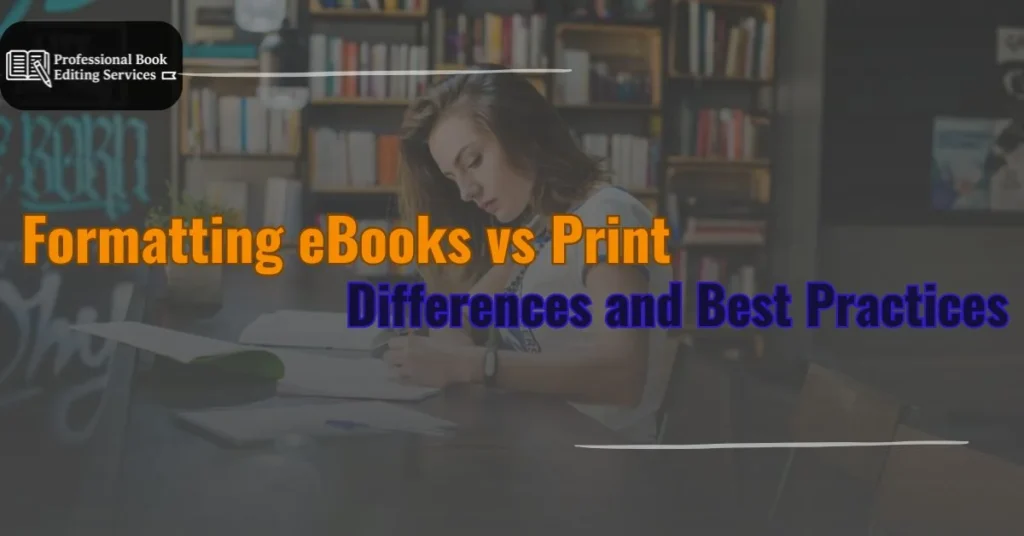
Designing for Digital and Print
Many authors are publishing both print and digital versions of their books. While layout rules differ between the two, understanding formatting eBooks vs print books helps ensure consistency in quality. Digital layouts are reflowable and adjust to screen sizes, while print layouts are fixed and require careful consideration of spacing, image placement, and type hierarchy.
A versatile design system accommodates both formats, allowing you to maintain brand identity across platforms while optimizing for reader usability. Tools like Adobe InDesign and Vellum offer templates that help manage these dual needs. And whether you’re including visual elements or working with plain text, proper layout supports narrative flow and reader immersion.
Beyond Layout: Tying It All Together
Effective layout works in harmony with every other aspect of book design. Your book cover design process sets expectations for genre and tone. The importance of book cover design can’t be overstated. It’s your reader’s first impression. But once they open the book, the interior layout carries the responsibility of delivering on that promise.
Whether you’re embedding images using professional book images and illustration guidelines, planning for multilingual editions, or selecting fonts with accessibility in mind, every element is a continuation of your design philosophy. Consistency across all these components builds a more compelling and readable product.
For authors working on multiple books, mastering book chapter design and visual motifs across titles helps reinforce brand cohesion. This continuity, inside and out, is what makes a series memorable and marketable.
Why Layout Basics Matter More Than Ever
As publishing becomes increasingly competitive, readers expect a professional finish, even from indie authors. Good layout design is invisible to most readers, until it goes wrong. But when done right, it creates a smooth, immersive experience that enhances your story and supports your message.
From trim size and margins to white space and font pairing, these book layout basics shape your reader’s journey page by page. They also influence production costs, market positioning, and even accessibility.
If you’re unsure how to bring these principles into your manuscript, our Book Design Services team can help turn your draft into a polished, press-ready book. You may also want to explore our companion article, How Does Book Editing Work?, to ensure your manuscript is structurally sound before it enters the design phase.
Every great book begins with a great manuscript, but it takes thoughtful layout to turn that manuscript into a seamless reading experience.