When a reader finishes a book they love, the first thing they often ask is: “Is there more?” That question leads them straight to the next title in your series. But what if your second book looks nothing like the first, different font, new layout, mismatched design? Visually, it tells the reader nothing about continuity. That’s why series design branding matters so much.
Designing for a series isn’t just about making each cover attractive. It’s about developing a unified identity that spans every installment. From typography and color palettes to layout and interior styling, consistency is key to keeping readers engaged and reinforcing your author brand. Whether you’re working with a professional or going the DIY route, the choices you make here set the tone for your whole catalogue.
Let’s explore how to approach a cohesive design for your book series and why it has such a powerful impact on both perception and sales.
Why Series Branding Is More Than Just Matching Covers
Series design branding is about recognition. When readers browse a bookstore or scroll online, they should be able to instantly spot your next book. Think of popular fantasy, romance, or thriller series. They all carry visual signatures that act like a promise to the reader: you’ll get the same voice, the same world, the same experience.
The importance of book cover design is magnified in a series. It doesn’t just introduce the book. It establishes continuity. Branding, in this context, is visual storytelling. The design must communicate that this book is part of something bigger, while still allowing each installment to stand alone.
Consistent use of book typography choices, layout structure, and color palettes builds reader trust and boosts click-through rates across your whole collection.
Laying the Foundation: The Series Style Guide
Before designing multiple covers, authors and designers should agree on a comprehensive style guide. This document becomes the blueprint for all visual decisions moving forward.
The book cover design process begins with this consistency. Choose a title font that aligns with your genre: bold and modern for thrillers, ornate and serif for historical fiction, playful for children’s books. Stick with it. Apply the same layout structure across each title: where the title appears, the author’s name placement, and how the series number is displayed.
Your color palette matters too. You can vary the dominant color between books (to distinguish them), but the hues should come from the same tonal family or follow a recurring pattern.
Inside the book, the tone and structure of design carry through. Whether your chapters begin with decorative motifs or bold drop caps, those features should remain steady. This brings us to the often-overlooked aspect of interior book font selection. Pairing consistent fonts with formatting that respects genre conventions is crucial for reader immersion.
Design Continuity from Cover to Interior
The outside of the book may draw attention, but the inside holds the experience together. Designing cohesive interiors across a series demands attention to the smaller, often invisible, details, ones that, when absent, feel disjointed or amateurish.
A unified series design will include matching book front matter and back matter for each title, dedications, acknowledgments, and about the author sections, laid out with the same spacing, fonts, and styling. Even running headers, page numbers, and margin sizes should mirror one another.
To keep things consistent, many publishers and indie authors now develop an interior style guide alongside the cover brief. This document outlines spacing, font size, header treatments, and paragraph formatting. It ensures that whether you’re formatting the second or fifth book, it feels like it belongs in the same universe.
Software choices also come into play. Using professional book formatting software like Vellum, Adobe InDesign, or Atticus allows you to build reusable templates that streamline the formatting process without sacrificing quality.
Avoiding Jarring Shifts in Style
One of the easiest ways to lose a reader between books is through design whiplash, when a sequel suddenly looks and feels like a completely different product. Inconsistent book layout basics, font shifts, or even changed image styles can send the message that care wasn’t taken.
When illustrations are involved, especially in genres like children’s books or non-fiction, maintaining cohesive book images and illustration guidelines is essential. The visual language should remain stable throughout: the way charts are labeled, the placement of captions, the drawing style, and even the use of white space.
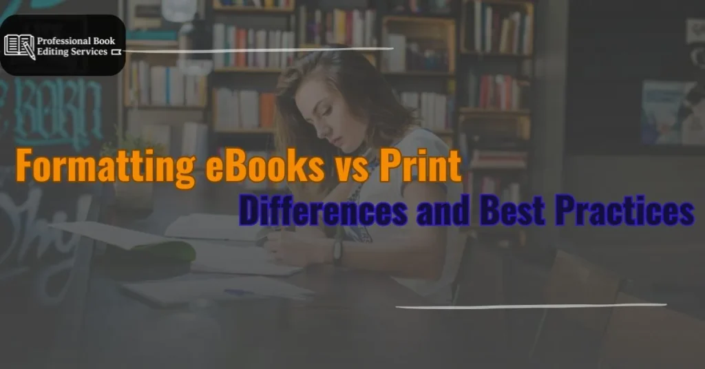
In digital formats, formatting eBooks vs print books introduces another layer of complexity. Covers need to look sharp in thumbnail form, which means being bold but legible. Meanwhile, eBook layouts should still reflect the print aesthetic whenever possible, though fluid text requires careful navigation of headings and section breaks to preserve visual cues.
Designing for Print and Digital Simultaneously
If your series is available in both formats, it’s essential to account for print-on-demand book formatting constraints from the beginning. Spine width, bleed lines, and color reproduction may vary from screen to print. A series cover that works well on paper may need adjustments to ensure it shines digitally, especially in e-commerce previews.
Creating mockups of the full series, side by side, can help evaluate how cohesive the designs look. Designers often lay out full box sets to assess whether each title flows naturally to the next.
When DIY Might Fall Short
Some authors handle design on their own, and there’s nothing wrong with experimenting. But in the context of a series, the risks multiply. Without expertise in grid alignment, color theory, and scalable typography, it becomes much harder to maintain consistency across multiple covers.
This is where the question of DIY vs professional book cover design comes in. A professional designer will create templates and guidelines that streamline future projects. They think in systems, not just one-off solutions. And when you’re five books deep, that structure can save you from a branding mess.
If you are taking the DIY route, invest time in studying current series in your genre. Pay attention to recurring layout elements and font pairings. Use test audiences or beta readers to evaluate whether your covers suggest continuity.
Chapter Design as a Branding Tool
Chapter openers are one of the most overlooked design assets in a series. Using consistent styling for book chapter design helps readers orient themselves and adds a polished touch. Whether it’s a small icon, a typographic motif, or an opening quote, repeating that structure across titles supports the reader’s sense of narrative progression.
Design elements that signal “you’re in the same world” make a huge difference in perceived professionalism.
Final Proofs and Quality Checks
Before you hit publish on any series entry, it’s essential to complete a full layout pass. Proofing book layout for each title helps catch misalignments in typography, headers, page numbers, or even small inconsistencies in front and back matter.
This phase is especially important if you’re using different tools or printers between books. Differences in software can introduce formatting discrepancies, spacing, margins, or line breaks that subtly erode your brand integrity.
Having a checklist for final review helps keep things on track, especially for multi-book projects.
Long-Term Benefits of Strong Series Branding
A well-designed series doesn’t just look good. It functions as a long-term sales tool. Each cover reinforces the others, driving visibility across platforms and strengthening your author brand.
From SEO listings to social media promotion, recognizable design elements tie your books together. They also support future campaigns like box sets, special editions, or rebrands. With strong branding, every addition to your catalogue builds momentum rather than starting from scratch.
If you’re looking to elevate your series design branding, explore our Book Design Services for expert support in layout, branding, and visual identity. And for tips on refining your manuscript before it reaches the design phase, check out our blog on Book Editing Tips.